Statistical Downscaling and Bias-Adjustment
xsdba provides tools and utilities to ease the bias-adjustment process. Almost all adjustment algorithms conform to the train - adjust scheme, formalized within TrainAdjust classes. Given a reference time series (ref), historical simulations (hist) and simulations to be adjusted (sim), any bias-adjustment method would be applied by first estimating the adjustment factors between the historical simulation and the observation series, and then applying these factors to
sim, which could be a future simulation.
This presents examples, while a bit more info and the API are given on this page.
Simple Quantile Mapping
A very simple “Quantile Mapping” approach is available through the EmpiricalQuantileMapping object. The object is created through the .train method of the class, and the simulation is adjusted with .adjust.
[1]:
from __future__ import annotations

import cftime  # noqa
import matplotlib.pyplot as plt
import nc_time_axis  # noqa
import numpy as np
import xarray as xr

%matplotlib inline
plt.style.use("seaborn-v0_8")
plt.rcParams["figure.figsize"] = (11, 5)

# Create toy data to explore bias adjustment, here fake temperature timeseries
t = xr.cftime_range("2000-01-01", "2030-12-31", freq="D", calendar="noleap")

ref = xr.DataArray(
    (
        -20 * np.cos(2 * np.pi * t.dayofyear / 365)
        + 2 * np.random.random_sample((t.size,))
        + 273.15
        + 0.1 * (t - t[0]).days / 365
    ),  # "warming" of 1K per decade,
    dims=("time",),
    coords={"time": t},
    attrs={"units": "K"},
)
sim = xr.DataArray(
    (
        -18 * np.cos(2 * np.pi * t.dayofyear / 365)
        + 2 * np.random.random_sample((t.size,))
        + 273.15
        + 0.11 * (t - t[0]).days / 365
    ),  # "warming" of 1.1K per decade
    dims=("time",),
    coords={"time": t},
    attrs={"units": "K"},
)

ref = ref.sel(time=slice(None, "2015-01-01"))
hist = sim.sel(time=slice(None, "2015-01-01"))

ref.plot(label="Reference")
sim.plot(label="Model")
plt.legend()
/tmp/ipykernel_2701/2278193960.py:14: FutureWarning: cftime_range() is deprecated, please use xarray.date_range(..., use_cftime=True) instead.
  t = xr.cftime_range("2000-01-01", "2030-12-31", freq="D", calendar="noleap")
[1]:
<matplotlib.legend.Legend at 0x764c1825fe00>

[2]:
import xsdba

QM = xsdba.EmpiricalQuantileMapping.train(
    ref, hist, nquantiles=15, group="time", kind="+"
)
scen = QM.adjust(sim, extrapolation="constant", interp="nearest")

ref.groupby("time.dayofyear").mean().plot(label="Reference")
hist.groupby("time.dayofyear").mean().plot(label="Model - biased")
scen.sel(time=slice("2000", "2015")).groupby("time.dayofyear").mean().plot(
    label="Model - adjusted - 2000-15", linestyle="--"
)
scen.sel(time=slice("2015", "2030")).groupby("time.dayofyear").mean().plot(
    label="Model - adjusted - 2015-30", linestyle="--"
)
plt.legend()
[2]:
<matplotlib.legend.Legend at 0x764bf0304cd0>

In the previous example, a simple Quantile Mapping algorithm was used with 15 quantiles and one group of values. The model performs well, but our toy data is also quite smooth and well-behaved so this is not surprising.
A more complex example could have bias distribution varying strongly across months. To perform the adjustment with different factors for each month, one can pass group='time.month'. Moreover, to reduce the risk of drastic changes in the adjustments at the interface of months, interp='linear' can be passed to .adjust and the adjustment factors will be interpolated linearly (e.g.: the factors for the 1st of May will be the average of those for both April and May).
[3]:
QM_mo = xsdba.EmpiricalQuantileMapping.train(
    ref, hist, nquantiles=15, group="time.month", kind="+"
)
scen = QM_mo.adjust(sim, extrapolation="constant", interp="linear")

ref.groupby("time.dayofyear").mean().plot(label="Reference")
hist.groupby("time.dayofyear").mean().plot(label="Model - biased")
scen.sel(time=slice("2000", "2015")).groupby("time.dayofyear").mean().plot(
    label="Model - adjusted - 2000-15", linestyle="--"
)
scen.sel(time=slice("2015", "2030")).groupby("time.dayofyear").mean().plot(
    label="Model - adjusted - 2015-30", linestyle="--"
)
plt.legend()
[3]:
<matplotlib.legend.Legend at 0x764bf018e210>

The training data (here the adjustment factors) is available for inspection in the ds attribute of the adjustment object.
[4]:
QM_mo.ds
[4]:
<xarray.Dataset> Size: 5kB
Dimensions:     (month: 12, quantiles: 15)
Coordinates:
  * month       (month) int64 96B 1 2 3 4 5 6 7 8 9 10 11 12
  * quantiles   (quantiles) float64 120B 0.03333 0.1 0.1667 ... 0.9 0.9667
Data variables:
    af          (month, quantiles) float64 1kB -1.822 -1.922 ... -1.866 -1.872
    hist_q      (month, quantiles) float64 1kB 255.9 256.4 256.7 ... 259.2 259.9
    hist_q_raw  (month, quantiles) float64 1kB nan nan nan nan ... nan nan nan
Attributes:
    group:               time.month
    group_compute_dims:  ['time']
    group_window:        1
    _xsdba_adjustment:   {"py/object": "xsdba.adjustment.EmpiricalQuantileMap...
adj_params: EmpiricalQuantileMapping(group=Grouper(name='time.mo...[5]:
QM_mo.ds.af.plot()
[5]:
<matplotlib.collections.QuadMesh at 0x764c46ad9e80>

Grouping
For basic time period grouping (months, day of year, season), passing a string to the methods needing it is sufficient. Most methods acting on grouped data also accept a window int argument to pad the groups with data from adjacent ones. Units of window are the sampling frequency of the main grouping dimension (usually time). For more complex grouping, or simply for clarity, one can pass a xsdba.base.Grouper directly.
Another example of a simpler, adjustment method is below; Here we want sim to be scaled so that its mean fits the one of ref. Scaling factors are to be computed separately for each day of the year, but including 15 days on either side of the day. This means that the factor for the 1st of May is computed including all values from the 16th of April to the 15th of May (of all years).
[6]:
group = xsdba.Grouper("time.dayofyear", window=31)
QM_doy = xsdba.Scaling.train(ref, hist, group=group, kind="+")
scen = QM_doy.adjust(sim)

ref.groupby("time.dayofyear").mean().plot(label="Reference")
hist.groupby("time.dayofyear").mean().plot(label="Model - biased")
scen.sel(time=slice("2000", "2015")).groupby("time.dayofyear").mean().plot(
    label="Model - adjusted - 2000-15", linestyle="--"
)
scen.sel(time=slice("2015", "2030")).groupby("time.dayofyear").mean().plot(
    label="Model - adjusted - 2015-30", linestyle="--"
)
plt.legend()
[6]:
<matplotlib.legend.Legend at 0x764bf00eb250>

[7]:
[7]:
<xarray.DataArray (time: 11315)> Size: 91kB
array([255.305375, 256.209911, 256.624259, ..., 259.611197, 258.86982 ,
       258.787337], shape=(11315,))
Coordinates:
  * time     (time) object 91kB 2000-01-01 00:00:00 ... 2030-12-31 00:00:00
Attributes:
units: K[8]:
QM_doy.ds.af.plot()
[8]:
[<matplotlib.lines.Line2D at 0x764bf00bf110>]

Modular approach
The xsdba module adopts a modular approach instead of implementing published and named methods directly. A generic bias adjustment process is laid out as follows:
preprocessing on
ref,histandsim(using methods inxsdba.processingorxsdba.detrending)creating and training the adjustment object
Adj = Adjustment.train(obs, hist, **kwargs)(fromxsdba.adjustment)adjustment
scen = Adj.adjust(sim, **kwargs)post-processing on
scen(for example: re-trending)
The train-adjust approach allows us to inspect the trained adjustment object. The training information is stored in the underlying Adj.ds dataset and often has a af variable with the adjustment factors. Its layout and the other available variables vary between the different algorithm, refer to their part of the API docs.
For heavy processing, this separation allows the computation and writing to disk of the training dataset before performing the adjustment(s). See the advanced notebook.
Parameters needed by the training and the adjustment are saved to the Adj.ds dataset as a adj_params attribute. For other parameters, those only needed by the adjustment are passed in the adjust call and written to the history attribute in the output scenario DataArray.
First example : pr and frequency adaptation
The next example generates fake precipitation data and adjusts the sim timeseries, but also adds a step where the dry-day frequency of hist is adapted so that it fits that of ref. This ensures well-behaved adjustment factors for the smaller quantiles. Note also that we are passing kind='*' to use the multiplicative mode. Adjustment factors will be multiplied/divided instead of being added/subtracted.
[9]:
vals = np.random.randint(0, 1000, size=(t.size,)) / 100
vals_ref = (4 ** np.where(vals < 9, vals / 100, vals)) / 3e6
vals_sim = (
    (1 + 0.1 * np.random.random_sample((t.size,)))
    * (4 ** np.where(vals < 9.5, vals / 100, vals))
    / 3e6
)

pr_ref = xr.DataArray(
    vals_ref, coords={"time": t}, dims=("time",), attrs={"units": "mm/day"}
)
pr_ref = pr_ref.sel(time=slice("2000", "2015"))
pr_sim = xr.DataArray(
    vals_sim, coords={"time": t}, dims=("time",), attrs={"units": "mm/day"}
)
pr_hist = pr_sim.sel(time=slice("2000", "2015"))

pr_ref.plot(alpha=0.9, label="Reference")
pr_sim.plot(alpha=0.7, label="Model")
plt.legend()
[9]:
<matplotlib.legend.Legend at 0x764bedf2f9d0>

[10]:
# 1st try without adapt_freq
QM = xsdba.EmpiricalQuantileMapping.train(
    pr_ref, pr_hist, nquantiles=15, kind="*", group="time"
)
scen = QM.adjust(pr_sim)

pr_ref.sel(time="2010").plot(alpha=0.9, label="Reference")
pr_hist.sel(time="2010").plot(alpha=0.7, label="Model - biased")
scen.sel(time="2010").plot(alpha=0.6, label="Model - adjusted")
plt.legend()
[10]:
<matplotlib.legend.Legend at 0x764bedfdf110>

In the figure above, scen has small peaks where sim is 0. This problem originates from the fact that there are more “dry days” (days with almost no precipitation) in hist than in ref. The next example works around the problem using frequency-adaptation, as described in Themeßl et al. (2012).
[11]:
# 2nd try with adapt_freq
hist_ad, pth, dP0 = xsdba.processing.adapt_freq(
    pr_ref, pr_hist, thresh="0.05 mm d-1", group="time"
)
QM_ad = xsdba.EmpiricalQuantileMapping.train(
    pr_ref, hist_ad, nquantiles=15, kind="*", group="time"
)
scen_ad = QM_ad.adjust(pr_sim)

pr_ref.sel(time="2010").plot(alpha=0.9, label="Reference")
pr_sim.sel(time="2010").plot(alpha=0.7, label="Model - biased")
scen_ad.sel(time="2010").plot(alpha=0.6, label="Model - adjusted")
plt.legend()
[11]:
<matplotlib.legend.Legend at 0x764bede625d0>

Second example: tas and detrending
The next example reuses the fake temperature timeseries generated at the beginning and applies the same QM adjustment method. However, for a better adjustment, we will scale sim to ref and then “detrend” the series, assuming the trend is linear. When sim (or sim_scl) is detrended, its values are now anomalies, so we need to normalize ref and hist so we can compare similar values.
This process is detailed here to show how the xsdba module should be used in custom adjustment processes, but this specific method also exists as xsdba.DetrendedQuantileMapping and is based on Cannon et al. 2015. However, DetrendedQuantileMapping normalizes over a time.dayofyear group, regardless of what is passed in the group argument. As done here, it is anyway recommended to use dayofyear groups when normalizing,
especially for variables with strong seasonal variations.
[12]:
doy_win31 = xsdba.Grouper("time.dayofyear", window=15)
Sca = xsdba.Scaling.train(ref, hist, group=doy_win31, kind="+")
sim_scl = Sca.adjust(sim)

detrender = xsdba.detrending.PolyDetrend(degree=1, group="time.dayofyear", kind="+")
sim_fit = detrender.fit(sim_scl)
sim_detrended = sim_fit.detrend(sim_scl)

ref_n, _ = xsdba.processing.normalize(ref, group=doy_win31, kind="+")
hist_n, _ = xsdba.processing.normalize(hist, group=doy_win31, kind="+")

QM = xsdba.EmpiricalQuantileMapping.train(
    ref_n, hist_n, nquantiles=15, group="time.month", kind="+"
)
scen_detrended = QM.adjust(sim_detrended, extrapolation="constant", interp="nearest")
scen = sim_fit.retrend(scen_detrended)


ref.groupby("time.dayofyear").mean().plot(label="Reference")
sim.groupby("time.dayofyear").mean().plot(label="Model - biased")
scen.sel(time=slice("2000", "2015")).groupby("time.dayofyear").mean().plot(
    label="Model - adjusted - 2000-15", linestyle="--"
)
scen.sel(time=slice("2015", "2030")).groupby("time.dayofyear").mean().plot(
    label="Model - adjusted - 2015-30", linestyle="--"
)
plt.legend()
[12]:
<matplotlib.legend.Legend at 0x764bedef4b90>

Third example : Multi-method protocol - Hnilica et al. 2017
In their paper of 2017, Hnilica, Hanel and Puš present a bias-adjustment method based on the principles of Principal Components Analysis.
The idea is simple: use principal components to define coordinates on the reference and on the simulation, and then transform the simulation data from the latter to the former. Spatial correlation can thus be conserved by taking different points as the dimensions of the transform space. The method was demonstrated in the article by bias-adjusting precipitation over different drainage basins.
The same method could be used for multivariate adjustment. The principle would be the same, concatenating the different variables into a single dataset along a new dimension. An example is given in the advanced notebook.
Here we show how the modularity of xsdba can be used to construct a quite complex adjustment protocol involving two adjustment methods : quantile mapping and principal components. Evidently, as this example uses only 2 years of data, it is not complete. It is meant to show how the adjustment functions and how the API can be used.
[13]:
# We are using xarray's "air_temperature" dataset
ds = xr.tutorial.load_dataset("air_temperature")
[14]:
# To get an exaggerated example we select different points
# here "lon" will be our dimension of two "spatially correlated" points
reft = ds.air.isel(lat=21, lon=[40, 52]).drop_vars(["lon", "lat"])
simt = ds.air.isel(lat=18, lon=[17, 35]).drop_vars(["lon", "lat"])

# Principal Components Adj, no grouping and use "lon" as the space dimensions
PCA = xsdba.PrincipalComponents.train(reft, simt, group="time", crd_dim="lon")
scen1 = PCA.adjust(simt)

# QM, no grouping, 20 quantiles and additive adjustment
EQM = xsdba.EmpiricalQuantileMapping.train(
    reft, scen1, group="time", nquantiles=50, kind="+"
)
scen2 = EQM.adjust(scen1)
[15]:
# some Analysis figures
fig = plt.figure(figsize=(12, 16))
gs = plt.matplotlib.gridspec.GridSpec(3, 2, fig)

axPCA = plt.subplot(gs[0, :])
axPCA.scatter(reft.isel(lon=0), reft.isel(lon=1), s=20, label="Reference")
axPCA.scatter(simt.isel(lon=0), simt.isel(lon=1), s=10, label="Simulation")
axPCA.scatter(scen2.isel(lon=0), scen2.isel(lon=1), s=3, label="Adjusted - PCA+EQM")
axPCA.set_xlabel("Point 1")
axPCA.set_ylabel("Point 2")
axPCA.set_title("PC-space")
axPCA.legend()

refQ = reft.quantile(EQM.ds.quantiles, dim="time")
simQ = simt.quantile(EQM.ds.quantiles, dim="time")
scen1Q = scen1.quantile(EQM.ds.quantiles, dim="time")
scen2Q = scen2.quantile(EQM.ds.quantiles, dim="time")

axQM = None
for i in range(2):
    if not axQM:
        axQM = plt.subplot(gs[1, 0])
    else:
        axQM = plt.subplot(gs[1, 1], sharey=axQM)
    axQM.plot(refQ.isel(lon=i), simQ.isel(lon=i), label="No adj")
    axQM.plot(refQ.isel(lon=i), scen1Q.isel(lon=i), label="PCA")
    axQM.plot(refQ.isel(lon=i), scen2Q.isel(lon=i), label="PCA+EQM")
    axQM.plot(
        refQ.isel(lon=i), refQ.isel(lon=i), color="k", linestyle=":", label="Ideal"
    )
    axQM.set_title(f"QQ plot - Point {i + 1}")
    axQM.set_xlabel("Reference")
    axQM.set_xlabel("Model")
    axQM.legend()

axT = plt.subplot(gs[2, :])
reft.isel(lon=0).plot(ax=axT, label="Reference")
simt.isel(lon=0).plot(ax=axT, label="Unadjusted sim")
# scen1.isel(lon=0).plot(ax=axT, label='PCA only')
scen2.isel(lon=0).plot(ax=axT, label="PCA+EQM")
axT.legend()
axT.set_title("Timeseries - Point 1")
[15]:
Text(0.5, 1.0, 'Timeseries - Point 1')

Fourth example : Multivariate bias-adjustment (Cannon, 2018)
This section replicates the “MBCn” algorithm described by Cannon (2018). The method relies on some univariate algorithm, an adaption of the N-pdf transform of Pitié et al. (2005) and a final reordering step.
In the following, we use the Adjusted and Homogenized Canadian Climate Dataset (AHCCD) and CanESM2 data as reference and simulation, respectively, and correct both pr and tasmax together.
NOTE This is a heavy computation. Some users report that using a manual parallelization rather than relying on dask was necessary for large datasets as the computation stalled/failed because of the large number of dask tasks. This probably is also true for the method
dOTCpresented in the next section.
Perform the multivariate adjustment (MBCn).
[16]:
import numpy as np

from xsdba.units import convert_units_to
from xclim.testing import open_dataset
import xclim

dref = open_dataset("sdba/ahccd_1950-2013.nc", drop_variables=["lat", "lon"]).sel(
    time=slice("1981", "2010")
)

# Fix the standard name of the `pr` variable.
# This allows the convert_units_to below to infer the correct CF transformation (precip rate to flux)
# see the "Unit handling" notebook
dref.pr.attrs["standard_name"] = "lwe_precipitation_rate"

# "hydro" context from xclim allows to convert precipitations from mm d-1 -> kg m-2 s-1
with xclim.core.units.units.context("hydro"):
    dref["tasmax"] = convert_units_to(dref.tasmax, "K")
    dref["pr"] = convert_units_to(dref.pr, "kg m-2 s-1")

dsim = open_dataset("sdba/CanESM2_1950-2100.nc", drop_variables=["lat", "lon"])

dhist = dsim.sel(time=slice("1981", "2010"))
dsim = dsim.sel(time=slice("2041", "2070"))

ref = xsdba.processing.stack_variables(dref)
hist = xsdba.processing.stack_variables(dhist)
sim = xsdba.processing.stack_variables(dsim)
[17]:
ADJ = xsdba.MBCn.train(
    ref,
    hist,
    base_kws={"nquantiles": 20, "group": "time"},
    adj_kws={"interp": "nearest", "extrapolation": "constant"},
    n_iter=20,  # perform 20 iteration
    n_escore=1000,  # only send 1000 points to the escore metric
)

scenh, scens = (
    ADJ.adjust(
        sim=ds,
        ref=ref,
        hist=hist,
        base=xsdba.QuantileDeltaMapping,
        base_kws_vars={
            "pr": {
                "kind": "*",
                "jitter_under_thresh_value": "0.01 kg m-2 d-1",
                "adapt_freq_thresh": "0.1 kg m-2 d-1",
            },
            "tasmax": {"kind": "+"},
        },
        adj_kws={"interp": "nearest", "extrapolation": "constant"},
    )
    for ds in (hist, sim)
)
Let’s trigger all the computations.
The use of dask.compute allows the three DataArrays to be computed at the same time, avoiding repeating the common steps.
[18]:
from dask import compute
from dask.diagnostics import ProgressBar

with ProgressBar():
    scenh, scens, escores = compute(scenh, scens, ADJ.ds.escores)
Let’s compare the series and look at the distance scores to see how well the N-pdf transform has converged.
[19]:
fig, axs = plt.subplots(1, 2, figsize=(16, 4))
for da, label in zip((ref, scenh, hist), ("Reference", "Adjusted", "Simulated")):
    ds = xsdba.unstack_variables(da).isel(location=2)
    # time series - tasmax
    ds.tasmax.plot(ax=axs[0], label=label, alpha=0.65 if label == "Adjusted" else 1)
    # scatter plot
    ds.plot.scatter(x="pr", y="tasmax", ax=axs[1], label=label)
axs[0].legend()
axs[1].legend()
[19]:
<matplotlib.legend.Legend at 0x764ba9ad07d0>

[20]:
escores.isel(location=2).plot()
plt.title("E-scores for each iteration.")
plt.xlabel("iteration")
plt.ylabel("E-score")
[20]:
Text(0, 0.5, 'E-score')

The tutorial continues in the advanced notebook with more on optimization with dask, other fancier detrending algorithms, and an example pipeline for heavy processing.
Fifth example : Dynamical Optimal Transport Correction - Robin et al. 2019
Robin, Vrac, Naveau and Yiou presented the dOTC multivariate bias correction method in a 2019 paper.
Here, we use optimal transport to find mappings between reference, simulated historical and simulated future data. Following these mappings, future simulation is corrected by applying the temporal evolution of model data to the reference.
In the following, we use the Adjusted and Homogenized Canadian Climate Dataset (AHCCD) and CanESM2 data as reference and simulation, respectively, and correct both pr and tasmax together.
Here we are going to correct the precipitations multiplicatively to make sure they don’t become negative. In this context, small precipitation values can lead to huge aberrations. This problem can be mitigated with adapt_freq_thresh. We also need to stack our variables into a dataArray before feeding them to dOTC.
Since the precipitations are treated multiplicatively, we have no choice but to use “std” for the cov_factor argument (the default), which means the rescaling of model data to the observed data scale is done independently for every variable. In the situation where one only has additive variables, it is recommended to use the “cholesky” cov_factor, in which case the rescaling is done in a multivariate fashion.
[21]:
# This function has random components
np.random.seed(0)

# Contrary to most algorithms in sdba, dOTC has no `train` method
scen = xsdba.adjustment.dOTC.adjust(
    ref,
    hist,
    sim,
    kind={
        "pr": "*"
    },  # Since this bias correction method is multivariate, `kind` must be specified per variable
    adapt_freq_thresh={"pr": "3.5e-4 kg m-2 s-1"},  # Idem
)
/home/docs/checkouts/readthedocs.org/user_builds/xsdba/conda/latest/lib/python3.13/site-packages/xsdba/_adjustment.py:1633: FutureWarning: dropping variables using `drop` is deprecated; use drop_vars.
  ds0 = ds0.drop("ref")
[22]:
# Some analysis figures

# Unstack variables and select a location
ref = xsdba.processing.unstack_variables(ref).isel(location=2)
hist = xsdba.processing.unstack_variables(hist).isel(location=2)
sim = xsdba.processing.unstack_variables(sim).isel(location=2)
scen = xsdba.processing.unstack_variables(scen).isel(location=2)

fig = plt.figure(figsize=(10, 10))
gs = plt.matplotlib.gridspec.GridSpec(2, 2, fig)
ax_pr = plt.subplot(gs[0, 0])
ax_tasmax = plt.subplot(gs[0, 1])
ax_scatter = plt.subplot(gs[1, :])

# Precipitation
hist.pr.plot(ax=ax_pr, color="c", label="Simulation (past)")
ref.pr.plot(ax=ax_pr, color="b", label="Reference", alpha=0.5)
sim.pr.plot(ax=ax_pr, color="y", label="Simulation (future)")
scen.pr.plot(ax=ax_pr, color="r", label="Corrected", alpha=0.5)
ax_pr.set_title("Precipitation")

# Maximum temperature
hist.tasmax.plot(ax=ax_tasmax, color="c")
ref.tasmax.plot(ax=ax_tasmax, color="b", alpha=0.5)
sim.tasmax.plot(ax=ax_tasmax, color="y")
scen.tasmax.plot(ax=ax_tasmax, color="r", alpha=0.5)
ax_tasmax.set_title("Maximum temperature")

# Scatter
ref.plot.scatter(x="tasmax", y="pr", ax=ax_scatter, color="b", edgecolors="k", s=20)
scen.plot.scatter(x="tasmax", y="pr", ax=ax_scatter, color="r", edgecolors="k", s=20)
sim.plot.scatter(x="tasmax", y="pr", ax=ax_scatter, color="y", edgecolors="k", s=20)
hist.plot.scatter(x="tasmax", y="pr", ax=ax_scatter, color="c", edgecolors="k", s=20)
ax_scatter.set_title("Variables distribution")

# Example mapping
max_time = scen.pr.idxmax().data
max_idx = np.where(scen.time.data == max_time)[0][0]

scen_x = scen.tasmax.isel(time=max_idx)
scen_y = scen.pr.isel(time=max_idx)
sim_x = sim.tasmax.isel(time=max_idx)
sim_y = sim.pr.isel(time=max_idx)

ax_scatter.scatter(scen_x, scen_y, color="r", edgecolors="k", s=30, linewidth=1)
ax_scatter.scatter(sim_x, sim_y, color="y", edgecolors="k", s=30, linewidth=1)

prop = dict(arrowstyle="-|>,head_width=0.3,head_length=0.8", facecolor="black", lw=1)
ax_scatter.annotate("", xy=(scen_x, scen_y), xytext=(sim_x, sim_y), arrowprops=prop)

ax_pr.legend()
[22]:
<matplotlib.legend.Legend at 0x764beac465d0>

This last plot shows the correlation between input and output per variable. Here we see a relatively strong correlation for all variables, meaning they are all taken into account when finding the optimal transport mappings. This is because we’re using the (by default) normalization = 'max_distance' argument. Were the data not normalized, the distances along the precipitation dimension would be very small relative to the temperature distances. Precipitation values would then be spread around
at very low cost and have virtually no effect on the result. See this in action with normalization = None.
The chunks we see in the tasmax data are artefacts of the bin_width.
[23]:
from scipy.stats import gaussian_kde

fig = plt.figure(figsize=(10, 5))
gs = plt.matplotlib.gridspec.GridSpec(1, 2, fig)

tasmax = plt.subplot(gs[0, 0])
pr = plt.subplot(gs[0, 1])

sim_t = sim.tasmax.to_numpy()
scen_t = scen.tasmax.to_numpy()
stack = np.vstack([sim_t, scen_t])
z = gaussian_kde(stack)(stack)
idx = z.argsort()
sim_t, scen_t, z = sim_t[idx], scen_t[idx], z[idx]
tasmax.scatter(sim_t, scen_t, c=z, s=1, cmap="viridis")
tasmax.set_title("Tasmax")
tasmax.set_ylabel("scen tasmax")
tasmax.set_xlabel("sim tasmax")

sim_p = sim.pr.to_numpy()
scen_p = scen.pr.to_numpy()
stack = np.vstack([sim_p, scen_p])
z = gaussian_kde(stack)(stack)
idx = z.argsort()
sim_p, scen_p, z = sim_p[idx], scen_p[idx], z[idx]
pr.scatter(sim_p, scen_p, c=z, s=1, cmap="viridis")
pr.set_title("Pr")
pr.set_ylabel("scen pr")
pr.set_xlabel("sim pr")

fig.suptitle("Correlations between input and output per variable")
[23]:
Text(0.5, 0.98, 'Correlations between input and output per variable')

Sixth example : Pooling multiple members together for quantile mapping
Here, we perform a very simple EmpiricalQuantileMapping adjustment, but the adjustment factors are computed by pulling all realizations of an ensemble together. The adjustment is done over the whole ensemble, using the same factors for all realizations. This behaviour is controlled through the “grouping”, simply by passing add_dims=['realization'] to the constructor of the Grouper object. These dimensions will be reduced at the same time as the main grouping dimension (usually
time) in the train step.
We’ll create a fake ensemble by spreading out the toy data used in example 1.3.4 and we’ll only adjust the historical series to see how pooling the members changed the result.
[24]:
# Create fake ensemble data by taking the same tasmax data than in example 1.3.4 and adding random noise
ref = dref.tasmax.isel(location=0, drop=True)

N_members = 10
with xr.set_options(keep_attrs=True):  # to preserve units in the addition
    fake_ensemble_noise = xr.DataArray(
        20 * np.random.random_sample((N_members,)) - 10, dims=("realization",)
    )
    hist = dhist.tasmax.isel(location=0, drop=True) + fake_ensemble_noise
[25]:
# Plot it to see what it looks like
hist.sel(time=slice("2000", "2005")).plot(
    hue="realization", alpha=0.8, add_legend=False
)
ref.sel(time=slice("2000", "2005")).plot(color="k")
[25]:
[<matplotlib.lines.Line2D at 0x764ba9a34550>]
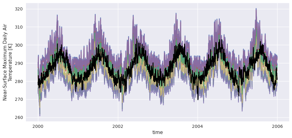
[26]:
# Train the QDM:
group = xsdba.Grouper("time", add_dims=["realization"])
EQM = xsdba.EmpiricalQuantileMapping.train(ref, hist, group=group)
Above, we told xsdba to include the realization dimension in the reducing operations, we can see that it was in fact included in the quantile computation as it doesn’t appear in the trained dataset:
[27]:
EQM.ds
[27]:
<xarray.Dataset> Size: 568B
Dimensions:     (group: 1, quantiles: 20)
Coordinates:
  * group       (group) int64 8B 1
  * quantiles   (quantiles) float32 80B 0.025 0.075 0.125 ... 0.875 0.925 0.975
Data variables:
    af          (group, quantiles) float64 160B 2.224 1.54 ... -6.796 -9.07
    hist_q      (group, quantiles) float64 160B 273.6 277.0 ... 303.0 307.6
    hist_q_raw  (group, quantiles) float64 160B nan nan nan nan ... nan nan nan
Attributes:
    group:               time
    group_compute_dims:  ['time', 'realization']
    group_window:        1
    _xsdba_adjustment:   {"py/object": "xsdba.adjustment.EmpiricalQuantileMap...
adj_params: EmpiricalQuantileMapping(group=Grouper(add_dims=['re...[28]:
scen = EQM.adjust(hist)
[29]:
scen.sel(time=slice("2000", "2005")).plot(hue="realization", alpha=0.4)
ref.sel(time=slice("2000", "2005")).plot(color="k");

In order to see the effect of pooling the realizations together, let’s redo the same adjustment without the additional argument :
[30]:
group2 = xsdba.Grouper("time")
EQM2 = xsdba.EmpiricalQuantileMapping.train(ref, hist, group=group2)
scen2 = EQM2.adjust(hist)
[31]:
scen2.sel(time=slice("2000", "2005")).plot(hue="realization", alpha=0.4)
ref.sel(time=slice("2000", "2005")).plot(color="k");
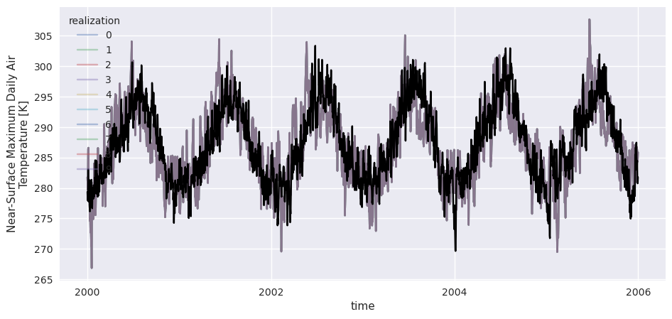
We can easily see that when the adjustment is done independently on each realization, the ensemble variability is squashed as each member is more precisely adjusted towards the reference. Pooling the members has the benefit of preserving a good part of the ensemble variability, which is sometimes interesting. Of course, in this example the ensemble has an artificial spread which doesn’t look very realistic.